Form Gets Messed up When Looking in Browser CSS? Fix It
June 3, 2026 Written by Maria
June 3, 2026 Written by Maria
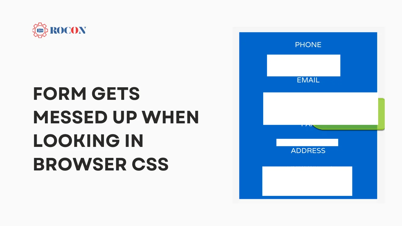
When a form looks perfect during development but appears broken in a browser, the issue is usually related to CSS conflicts, browser rendering differences, or responsive design problems. Misaligned fields, overlapping labels, inconsistent spacing, and broken layouts can negatively impact both usability and conversions.
Modern browsers generally follow web standards, but they can still interpret CSS rules differently. Custom styles, third-party frameworks, plugins, and outdated code may create unexpected layout issues that cause forms to display incorrectly across devices and browsers.
Responsive design is another common factor. A form that looks great on a desktop screen may become distorted on tablets or mobile devices if the CSS isn’t optimized for different screen sizes. Without proper testing, these issues can easily go unnoticed until users report them.
In this guide, you’ll learn the most common reasons forms become misaligned in browsers, how to troubleshoot CSS-related issues, and the best practices for building responsive, cross-browser-compatible forms that maintain a consistent appearance on every device.
Before diving into solutions, it’s essential to understand why form layouts often appear incorrect or messy in the browser. Several common causes contribute to these issues:
Each browser has its own rendering engine, which can interpret CSS rules differently. For example, an input field styled in Chrome may look slightly different in Firefox or Safari. Even subtle differences, like font rendering or padding, can impact the overall form layout.
Browsers apply default styles to elements, including form controls (e.g., inputs, buttons). A lack of CSS reset can cause inconsistencies in padding, margin, and font styling. Using a CSS reset or normalization stylesheet like Normalize.css helps create a baseline, ensuring elements start from a uniform styling foundation across browsers.
Forms need to look good on various screen sizes, but responsive design for forms can be tricky. Media queries are essential for adjusting layouts on mobile, tablet, and desktop. However, issues like overlapping elements or incorrect alignment often arise if breakpoints aren’t set correctly.
When building form layouts, modern CSS layout methods like CSS Grid and Flexbox are invaluable. Both offer flexibility, making it easier to control the positioning and alignment of form elements.
Grid and Flexbox were designed for layout control. Flexbox is great for simple, one-dimensional layouts (horizontal or vertical), while CSS Grid is ideal for complex two-dimensional layouts. These layout methods help you create clean, responsive forms without relying on complex positioning.
CSS Grid allows you to define columns and rows for a layout, making it easier to align elements precisely.
css
.form-grid {
display: grid;
grid-template-columns: 1fr 2fr;
gap: 20px;
}
.form-grid label {
text-align: right;
}
.form-grid input {
width: 100%;
padding: 10px;
}
In this example, the form layout has two columns: one for labels and one for inputs. The gap property adds spacing between rows and columns. CSS Grid makes aligning and distributing form elements simpler and ensures consistency across screen sizes.
For simpler forms, Flexbox is often more than enough. It excels at aligning elements in a single row or column, which works well for horizontal forms.
css
.form-flex {
display: flex;
flex-direction: row;
align-items: center;
gap: 15px;
}
.form-flex label {
min-width: 100px;
}
.form-flex input {
flex: 1;
padding: 8px;
}
This layout aligns labels and inputs side-by-side. By setting flex-direction: row, we arrange the form items horizontally. Flexbox’s ability to handle dynamic spacing and alignments makes it great for clean and consistent form layouts.
Form controls, such as inputs, buttons, and labels, come with unique styling needs and can behave differently across browsers. Managing these styles correctly is essential for consistent form appearance.
Properly styling form elements improves both the aesthetics and usability of forms.
css
input, button {
font-size: 16px;
padding: 8px 12px;
border: 1px solid #ccc;
border-radius: 4px;
}
label {
font-weight: bold;
}
By applying styles like padding, font size, and border-radius, you can create a consistent, user-friendly appearance. Customizing placeholder text and adjusting focus styles are also critical for usability and accessibility.
Browsers often have default styles for form elements, especially for buttons and input fields. Vendor prefixes or custom properties may be necessary for consistency across browsers.
css
button {
appearance: none;
-webkit-appearance: none; /* Safari */
background-color: #007BFF;
color: white;
padding: 10px 20px;
border: none;
border-radius: 5px;
cursor: pointer;
}
button:hover {
background-color: #0056b3;
}
The appearance: none property removes default button styles, allowing you to customize the button’s look entirely.
Accessible forms improve usability for everyone, including people using assistive technology.
Accessibility Tips:
Even with careful styling, form elements may misalign, overlap, or behave unexpectedly. Let’s explore some common troubleshooting techniques.
Alignment issues are often caused by padding, margins, or incorrect positioning.
Troubleshooting Tip: Use the browser’s developer tools (Inspect Element) to view an element’s box model, including margin, padding, and border. Adjusting these values helps fix misalignments.
Responsive design ensures forms look good across devices. Setting appropriate media queries helps adjust form elements on smaller screens.
css
@media (max-width: 768px) {
.form-grid {
grid-template-columns: 1fr;
}
.form-flex {
flex-direction: column;
}
}
These media queries make a two-column layout single-column on smaller screens, improving readability and usability.
Developer tools are essential for identifying the source of layout issues.
Forms may look great on one browser but appear misaligned on another. Ensuring cross-browser consistency is crucial.
Testing on Chrome, Firefox, Safari, and Edge is essential, as each has unique rendering quirks. Tools like BrowserStack or CrossBrowserTesting allow you to see how forms appear across browsers and devices.
Mobile compatibility is critical for forms, as many users access websites on mobile devices.
Sometimes CSS alone isn’t enough for complex form layouts. JavaScript can add interactivity and advanced styling.
JavaScript can help dynamically adjust layouts or apply conditional styling based on user interaction.
javascript
window.addEventListener(‘resize’, () => {
const form = document.querySelector(‘.form-grid’);
if (window.innerWidth < 600) {
form.style.gridTemplateColumns = ‘1fr’;
} else {
form.style.gridTemplateColumns = ‘1fr 2fr’;
}
});
This script adjusts the form’s column layout based on screen size, ensuring a responsive experience.
JavaScript libraries like jQuery or React offer enhanced styling options and interactive features.
javascript
$(‘input’).on(‘focus’, function() {
$(this).css(‘border-color’, ‘#007BFF’);
});
$(‘input’).on(‘blur’, function() {
$(this).css(‘border-color’, ‘#ccc’);
});
This example highlights inputs on focus, creating a dynamic and interactive form experience.
Creating flawlessly formatted forms across browsers and devices necessitates a combination of CSS approaches, new layout strategies, and thorough testing. Flexbox and Grid make it easier to create flexible, responsive forms, while troubleshooting tools such as developer tools and media queries assist in fine-tuning difficulties.
Whether you’re controlling form alignment, styling controls, or maintaining cross-browser consistency, the advice in this book will help you create dependable, user-friendly forms that look beautiful on any device. Forms are vital for user engagement, and with the right strategies, you can ensure that they always look professional and function properly.
To center text inside a button, use text-align: center for horizontal alignment. For vertically centered text, use Flexbox with display: flex, align-items: center, and justify-content: center. This ensures consistent button alignment across modern browsers.
background-blend-mode only works when multiple background layers or a background color and image are present. If the property isn’t working, verify that multiple backgrounds are defined and check browser compatibility and CSS syntax.
If box-sizing: border-box isn’t working, the rule may be overridden by another CSS declaration. Check for conflicting styles and ensure the property is applied to the correct element. Many developers apply * { box-sizing: border-box; } globally for consistent layouts.
The easiest way is to place the iframe inside a container using Flexbox. Set the parent element to display: flex, then use justify-content: center and align-items: center to center the iframe both horizontally and vertically.
Use CSS Grid or Flexbox to create a consistent form layout. Assign equal widths to input fields and use proper spacing between labels and form controls. This prevents misalignment issues across different browsers and screen sizes.
To place a label and input field on the same line, use Flexbox. Apply display: flex to the parent container and add appropriate spacing with gap or margin. This creates a clean and responsive form layout.
Elevate your WordPress hosting with 30-day money-back guarantee, free migration, and 24/7 support.
Sign Up Today

May 15, 2026
Maria

May 8, 2026
Nitish
Before You Go… Get 1 Month FREE on Rocon Hosting!

Experience lightning-fast speeds

No downtime or hidden fees

Dedicated 24/7 expert support

Leave a Reply