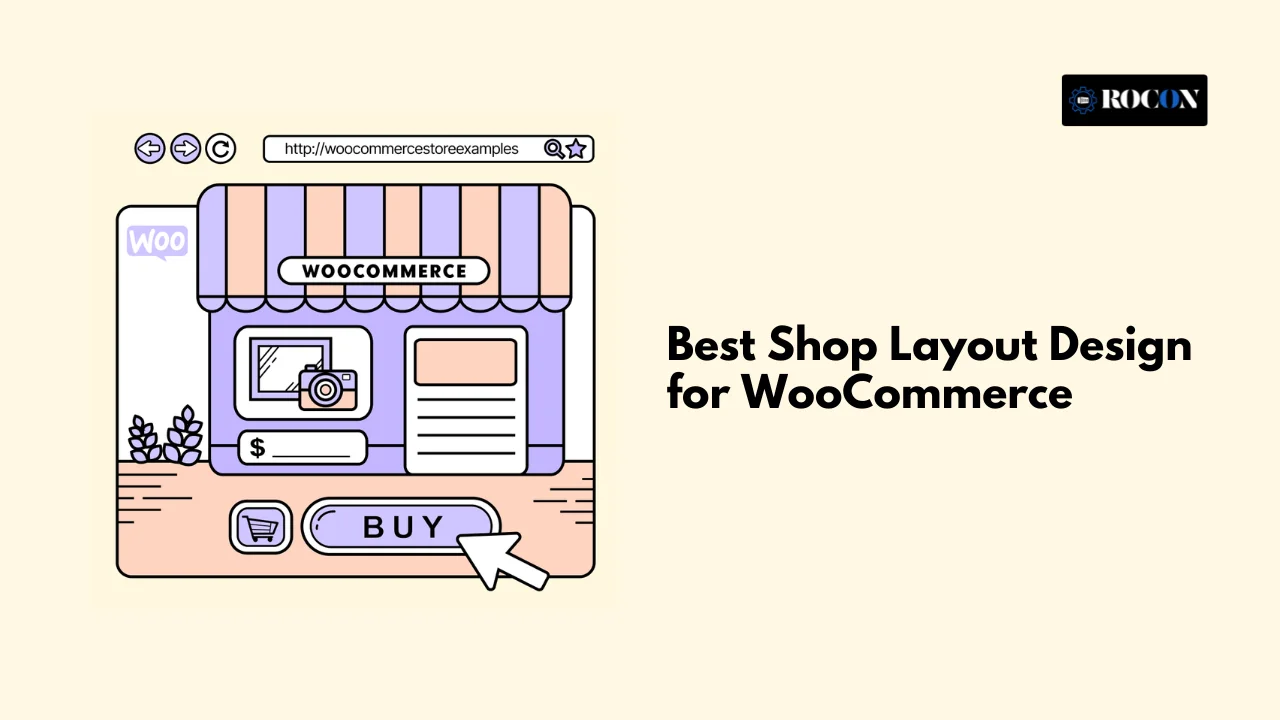
Best Shop Layout Design for WooCommerce – 7 Best Templates
October 14, 2025 Written by rocon_rocon
October 14, 2025 Written by rocon_rocon
When we talk about best shop layout design for WooCommerce we’re not just talking about how your store looks. It’s the entire structure and flow of your online shop—from how your products are displayed in a grid, how your navigation guides users, down to how your site feels on mobile devices.
A good layout does more than look nice. It impacts your UX, conversion rates and brand perception. A bad layout can frustrate customers, a good one can make browsing easy and checkout seamless.
In 2025 customers expect more than ever. Shoppers want fast loading layouts, mobile first designs and visual merchandising that mirrors real retail experiences. Your shop layout can be the difference between a one time visitor and a loyal customer.
That’s where hosting comes in. Even the most beautiful WooCommerce shop layout won’t perform if your site is slow. Providers like Rocon offer performance focused hosting with container based technology and built in CDN so your shop looks and feels fast no matter how design heavy it is.
In this guide we’ll break down the best WooCommerce shop layout designs, when to use them and how to optimize them for speed and conversions. By the end you’ll have a clear roadmap to design an online shop that’s not just pretty—but profitable.
Before we get into the nitty gritty of layout patterns, you need to understand the core principles that make a shop work. Think of these as the foundation of how customers interact with your store.
A strong layout uses visual hierarchy to guide customers’ eyes where you want them to go. This means:
Your store should naturally flow—drawing attention to important sections without overwhelming shoppers with clutter.
Over 70% of e-commerce traffic is now mobile, so mobile first is non negotiable. Responsive grids, touch friendly buttons and layouts that adapt to any screen size are key.
A common mistake is to design for the desktop first and then shrink it down. Instead design for mobile first and then expand for desktop. This way your site is usable in the most common shopping scenario – on the go.
Your layout is only as good as your navigation. A beautiful design won’t matter if users can’t find what they need. Best practices include:
Shoppers should reach their product of choice within 3 clicks or less.
Online shopping removes the “touch-and-feel” aspect, so visuals carry the weight. A strong shop layout supports features like:
The more real the product feels on screen the higher the chances of conversion.
Takeaway: Every successful WooCommerce shop is built on these principles. Whether you choose a grid, list or something more experimental, these fundamentals will make your layout convert.
Now that we’ve covered the principles, let’s explore the most effective layout patterns for WooCommerce shops in 2025. Each pattern serves a different type of product catalog and customer journey.
Category: Home & Lifestyle
Why it works:
Aarke, known for its sleek carbonators and kitchenware, uses a minimalist grid layout that mirrors the premium nature of its products. Their WooCommerce store is a masterclass in letting design breathe.
Takeaway: Minimalism works wonders when your product is strong enough to speak for itself. Use this if your shop is about luxury, design, or premium quality.
Category: Footwear & Apparel
Why it works:
Allbirds, the eco-friendly shoe brand, takes WooCommerce to another level by merging lifestyle-driven visuals with product storytelling.
Takeaway: If your brand has a mission-driven story, use layout as a storytelling canvas. This creates deeper emotional connections and repeat buyers.
Category: Fashion & Accessories
Why it works:
BluKicks sells vibrant footwear, and their WooCommerce store perfectly matches their brand identity with a colorful, bold grid layout.
Takeaway: If your brand is quirky, colorful, or fun, use a bold grid and playful interactions to create a lively, memorable shopping experience.
Category: Tech & Plugins
Why it works:
Sometimes the classic shop layout is unbeatable. The official WooCommerce store demonstrates how a straightforward, clean layout can scale with thousands of SKUs.
Takeaway: For shops with large catalogs, clarity and simplicity always beat flashy designs. Customers just want to find what they need quickly.
Category: Music & Vinyl Records
Why it works:
Pale Blue Dot sells vinyl records and proves that niche stores can win with personality-driven design.
Takeaway: If you’re in a creative niche, let the product’s uniqueness (art, books, crafts) dictate your layout. A masonry grid gives visual energy and authenticity.
Category: Food & Beverage
Why it works:
Porter & York sells premium meats online and uses high-definition photography + grid layout to create appetite appeal while keeping trust elements in view.
Takeaway: For food or consumable brands, rich visuals + clear functionality create both desire and trust. Pair this with optimized speed (so heavy photos don’t slow things down).
Perfect for visually rich brands like art, lifestyle, or décor. Instead of uniform rows, products display in a Pinterest-style masonry grid.
Best use case: Stores where visuals do the heavy lifting. Fashion boutiques, home decor, and craft stores thrive here.
Why it works: It feels dynamic and creative, helping products stand out.
Even the most gorgeous design can fail if it’s frustrating. To win in 2025, WooCommerce stores need to balance beauty and usability. Beyond choosing a design style, you need to add interactive elements that make shopping faster, easier and more fun.
Here are the key layout features that elevate user experience:
Not every shopper browses the same way. Some prefer grids for quick scanning, while others want lists for detail-heavy comparisons. Offering a toggle control between grid and list view lets customers choose their preferred style.
This small feature significantly reduces bounce rates since users feel in control of their browsing experience.
Imagine scrolling through 500 products without a way to filter them quickly—it’s frustrating. That’s where sticky filters and sidebar navigation shine.
Key elements include:
When filters remain visible, shoppers don’t have to scroll back to refine their results, which keeps them engaged longer.
Nobody enjoys opening product pages, waiting for them to load, then hitting “back” repeatedly. Quick view modals solve this by letting customers preview details, images, and even add items to cart—all without leaving the main shop page.
This feature shortens the shopping loop and works particularly well in fashion, accessories, and lifestyle stores where quick comparisons matter.
Images are the heaviest assets on shop pages. If your layout loads all images upfront, it slows the page. Lazy loading solves this by loading images when they come into view.
Result: Faster perceived load times, better Core Web Vitals scores and smoother browsing – without compromising on looks.
Instead of dropping users straight into a product dump, guide them visually with category grids. For example:
This approach mirrors retail store aisles, making navigation intuitive while showcasing the breadth of your catalog.
Pro Insight: Usability features aren’t just nice-to-have add-ons. They directly impact metrics like time on site, bounce rate, and conversion rate. A store with sticky filters and quick view modals can convert 15–20% better than a store without them.
A great WooCommerce layout isn’t just about tech—it’s about merchandising psychology. Traditional retail stores use visual merchandising strategies to influence purchase behavior. These principles translate perfectly to digital shop design.
Here’s how to apply retail strategies to your WooCommerce layout:
Retailers place related items together—think shoes next to socks. Online, you can mimic this by:
Colors influence emotions and buying decisions. For instance:
Strategically using color across buttons, banners, and product highlights can nudge users toward action.
In retail, prime shelves are at eye level. Online, the equivalent is the first scroll screen (above the fold). This is where you should highlight:
If users don’t see something enticing immediately, they may leave.
Balance close-up product shots (to showcase details) with lifestyle images (to help customers imagine the product in use). For example:
Retailers use planograms (visual maps of store shelves) to plan where products go. Digitally this means structuring your layout so the most profitable items get maximum visibility.
Pro Insight: Visual merchandising applied digitally makes your store feel intentional not random. It tells a story, guides customer behavior and increases basket size.
The good news? You don’t need to be a developer to create powerful WooCommerce layouts. A range of tools and plugins let you design visually rich, conversion-focused shops without coding.
Here are the best ones for 2025:
Best for: Shop owners who want pixel-perfect customization.
Best for: Speed-conscious stores needing lightweight solutions.
Best for: Stores wanting to replicate modern e-commerce UX found in Amazon or Zara.
Not all plugins are equal. Choose lightweight, performance-optimized plugins that won’t bloat your store. Avoid heavy page builders stacked with dozens of add-ons unless absolutely necessary.
Pro Tip: Always test plugin impact using tools like GTmetrix or PageSpeed Insights. A plugin that looks great but slows your shop by 3 seconds is hurting more than helping.
One of the best ways to understand layout design is by looking at real-world challenges that WooCommerce store owners face—and how to solve them. Here are a few practical examples that often appear on forums like Reddit and WordPress communities:
Solution: Implement a category-first shop structure. Instead of dumping visitors into a product feed, create a layout where the homepage shows main categories in a grid (e.g. Men, Women, Accessories). Using Elementor archive templates or WooCommerce catalog settings you can make sure users navigate logically – just like walking down aisles in a store.
Solution: Optimize for performance without sacrificing visuals. Use WebP images, compress with TinyPNG, and lazy load. If you’re using a grid or carousel heavy layout, test the performance impact and strip out unnecessary scripts. Hosting also plays a role—choosing a fast WordPress host like Rocon ensures image-rich layouts don’t drag down page speed.
A beautiful shop design is useless if it loads slowly. In e-commerce every second counts—Google says a 1 second delay can reduce conversions by 7%. So performance and layout have to go hand in hand.
Here’s how to keep shop layouts fast and efficient in 2025:
Lazy loading means images, videos and scripts only load when they are visible on the screen. This reduces initial page load time and improves Core Web Vitals, SEO and user experience.
This prevents layout shifts and keeps interactions snappy.
Although they look nice, sliders are often script heavy and slow. Use them sparingly and only where they actually enhance the shopping experience.
A CDN delivers your product images, styles and scripts from the nearest server to the user. This speeds up load times globally—important for WooCommerce shops targeting international customers.
Even with all optimizations, slow hosting can bottleneck your site. High-performance hosting providers like Rocon use container-based infrastructure and built-in CDN to ensure your shop loads in milliseconds—even with image-rich, dynamic layouts.
Pro Insight: Think of performance as the invisible layout layer. Customers won’t consciously notice it, but they’ll feel it. Fast-loading stores build trust and keep users shopping longer.
At this point, you know that layout design and performance are deeply connected. But here’s the catch: most store owners optimize layouts only to see performance tank due to poor hosting. That’s where Rocon changes the game.
Here’s how Rocon empowers WooCommerce shop layouts:
Unlike shared hosting, Rocon uses isolated containers for each site. This means your WooCommerce store gets dedicated resources, preventing slowdowns from “noisy neighbors.”
No need to install multiple plugins—Rocon comes with global CDN integration and server-level caching. This ensures that even grid-heavy layouts or masonry product displays load seamlessly.
Running a sale or seasonal campaign? Rocon’s infrastructure auto-scales to handle high traffic without crashes or lag. Your beautiful shop layout stays responsive, even under pressure.
Firewalls, malware scanning, and real-time monitoring keep your store safe. Since security is handled at the server level, you don’t need to bloat your site with extra plugins.
One of Rocon’s clients, a lifestyle brand, implemented an advanced grid + filter layout to showcase over 2,000 products. On traditional hosting, their site lagged during peak hours. After moving to Rocon, load times dropped below 1.2 seconds globally, and conversions increased by 18%—proving that fast hosting fuels layout success.
Bottom Line: A great shop layout shines only when paired with hosting that delivers speed, reliability, and scalability. That’s why WooCommerce store owners trust Rocon to keep design and performance aligned.
The best WooCommerce shop design isn’t just about looks – it’s about guiding customers from browse to buy. From grids and filters to merchandising psychology, everything matters. But layout alone isn’t enough. Without fast performance, even the most beautiful design will fail.
Here’s your action plan for success:
Your WooCommerce shop deserves more than just a pretty face – it deserves a design that converts and a platform that performs. Get started with Rocon today and build a shop experience your customers love – and Google rewards.
WooCommerce is an open source eCommerce plugin for WordPress that lets you build an online store of your own. It’s one of the most popular because it’s free, flexible and has thousands of plugins and themes. Whether you’re a small business or a large online brand, WooCommerce gives you full control over design, functionality and performance – especially when hosted on Rocon’s fast container-based WordPress hosting.
Yes! WooCommerce is for everyone – even if you don’t know how to code. With drag-and-drop editors and WordPress themes you can build a professional online store. And Rocon’s managed hosting takes care of all the technical setup and performance optimisation so you can focus on growing your business not configuring complex settings.
A great WooCommerce store shines with great design, smooth shopping and super fast. Key features are easy navigation, fast load times, mobile friendly and secure checkout. When you have Rocon your WooCommerce store also gets container based architecture, built in caching and auto scaling resources so your customers have a smooth and reliable experience every time they visit.
Yes, you can make a lot of money with a WooCommerce store – especially when its built and hosted on the right platform. WooCommerce gives you complete freedom to design, price and scale your store without paying high monthly fees like many other closed e-commerce platforms. When you pair WooCommerce with Rocon’s managed WordPress hosting you get the perfect foundation for growth: fast load times, top security and zero downtime during traffic spikes.
Elevate your WordPress hosting with 30-day money-back guarantee, free migration, and 24/7 support.
Sign Up Today
May 15, 2026
Maria
May 8, 2026
Nitish
Before You Go… Get 1 Month FREE on Rocon Hosting!

Experience lightning-fast speeds

No downtime or hidden fees

Dedicated 24/7 expert support

Leave a Reply