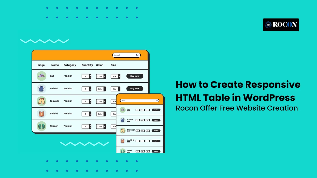
How to Create a Responsive HTML Table in WordPress: Step-by-Step Guide
November 4, 2025 by Adam
November 4, 2025 by Adam
To create a responsive HTML table in WordPress, you can use simple CSS (overflow-x: auto), or install plugins like TablePress, Ninja Tables, or wpDataTables. A responsive table adjusts automatically on mobile screens—either by enabling horizontal scroll or stacking columns vertically—ensuring better user experience, SEO performance, and accessibility.
If you’ve ever added a table to your WordPress post and noticed it breaking or overflowing on mobile screens, you’re not alone. Traditional HTML tables often look great on desktops but fail to adapt to smaller devices—hurting readability and user experience.
That’s where a responsive HTML table in WordPress comes in. A responsive table automatically adjusts its layout, either by enabling horizontal scrolling or stacking rows vertically, so your data stays clean and easy to read on any screen size.
Whether you’re showcasing product comparisons, pricing plans, or business reports, responsive tables ensure your content remains visually consistent and mobile-friendly.
In this guide, we’ll walk through both code-based and plugin-based methods to build responsive tables in WordPress, share best practices for accessibility, and explore tools —so you can create beautiful, functional tables without compromising performance or SEO.
A responsive HTML table is a table that automatically adjusts its layout to look perfect on every device — whether it’s a desktop, tablet, or smartphone. In traditional HTML, tables are rigid by default, which means they often overflow or break when viewed on smaller screens. A responsive table, on the other hand, uses modern CSS techniques, media queries, or sometimes JavaScript to adapt smoothly to different screen sizes.
Depending on the design approach, your table might enable horizontal scrolling, allowing users to swipe through columns, or stack each row vertically like a card for easy mobile reading. Some advanced solutions even transform the layout dynamically for better readability.
In simple terms, a responsive table ensures your tabular data — such as pricing comparisons, feature charts, or project schedules — stays visually clean, accessible, and mobile-friendly. It’s an essential element of responsive web design that helps improve user experience, SEO performance, and overall site usability on your WordPress website.
Google’s mobile-first indexing has made mobile responsiveness a key ranking factor for every WordPress site. When your tables aren’t optimized for smaller screens, they can easily break layout design, force unnecessary horizontal scrolling, and frustrate visitors—leading to poor user experience and higher bounce rates.
Responsive tables, on the other hand, ensure your data looks clean, scrollable, and easy to read on any device. Beyond aesthetics, they also play a major role in your website’s technical performance and SEO success.
Responsive tables benefit your WordPress site in several ways:
According to Google’s Page Experience update, mobile-friendly elements like responsive tables don’t just enhance usability—they directly contribute to better visibility in search results.
If you prefer a hands-on approach, creating a responsive HTML table in WordPress using custom HTML and CSS gives you full design control. It’s a great option if you want lightweight code without relying on plugins. Let’s go through it step by step.
<table class=”responsive-table”>
<thead>
<tr>
<th>Plan</th>
<th>Storage</th>
<th>Bandwidth</th>
<th>Price</th>
</tr>
</thead>
<tbody>
<tr>
<td>Basic</td>
<td>10GB</td>
<td>100GB</td>
<td>$5/mo</td>
</tr>
<tr>
<td>Pro</td>
<td>50GB</td>
<td>500GB</td>
<td>$10/mo</td>
</tr>
<tr>
<td>Business</td>
<td>200GB</td>
<td>2TB</td>
<td>$20/mo</td>
</tr>
</tbody>
</table>
This creates a clean, semantic table structure that’s easy to style later.
Next, we’ll use CSS media queries and overflow properties to make the table flexible across all devices.
Go to your WordPress Customizer → Additional CSS or your theme’s stylesheet, then add:
.responsive-table {
width: 100%;
border-collapse: collapse;
margin-bottom: 1.5rem;
}
.responsive-table th,
.responsive-table td {
border: 1px solid #ddd;
padding: 10px;
text-align: left;
}
.responsive-table thead {
background-color: #f7f7f7;
font-weight: bold;
}
/* Enable horizontal scrolling on small screens */
@media (max-width: 768px) {
.responsive-table {
display: block;
overflow-x: auto;
white-space: nowrap;
}
}
This CSS ensures that your table will automatically scroll horizontally when viewed on smaller devices instead of breaking or overflowing the layout.
If you want a more modern responsive effect, where each table row becomes a vertical “card” on small screens, you can use a more advanced CSS snippet:
@media (max-width: 600px) {
.responsive-table thead {
display: none;
}
.responsive-table,
.responsive-table tbody,
.responsive-table tr,
.responsive-table td {
display: block;
width: 100%;
}
.responsive-table tr {
margin-bottom: 15px;
border: 1px solid #ddd;
border-radius: 8px;
padding: 10px;
}
.responsive-table td {
text-align: right;
position: relative;
padding-left: 50%;
}
.responsive-table td::before {
content: attr(data-label);
position: absolute;
left: 10px;
width: 45%;
padding-left: 10px;
font-weight: bold;
text-align: left;
}
}
Then, update your HTML table cells to include data-label attributes:
<td data-label=”Plan”>Pro</td>
<td data-label=”Storage”>50GB</td>
<td data-label=”Bandwidth”>500GB</td>
<td data-label=”Price”>$10/mo</td>
Now, each cell automatically shows a label (like “Storage” or “Price”) above its value on small screens — just like a mobile-friendly pricing card.
Finally, preview your page and resize the browser window. Check how the table behaves on tablets and smartphones. You can also test it using Chrome DevTools (Right-click → Inspect → Toggle Device Toolbar).
A responsive HTML table not only looks better but also improves mobile usability, accessibility, and SEO performance, ensuring your site aligns with Google’s Core Web Vitals standards.
If you prefer a no-code approach, using a WordPress table plugin is the easiest way to create fully responsive HTML tables without touching a single line of code. Plugins simplify table management, add sorting and filtering features, and ensure full mobile responsiveness by default.
Let’s explore how to create a responsive HTML table in WordPress using plugins, step by step.
There are many table plugins available, but only a few stand out for performance, flexibility, and responsiveness. Here are the most popular options:
Each plugin is beginner-friendly and mobile-optimized, making it perfect for creating responsive tables in just minutes.
Once activated, you’ll see a new menu item (like “TablePress” or “WP Table Builder”) appear in your WordPress sidebar.
Let’s take TablePress as an example:
Tip: You can add links, images, shortcodes, or formatted text in any cell.
By default, TablePress tables aren’t fully responsive. But you can easily fix this with an extension or a simple CSS tweak:
.tablepress {
width: 100%;
overflow-x: auto;
display: block;
}
Add this code under Appearance → Customize → Additional CSS.
Now, your tables will fit neatly within any screen width.
Each table you create generates a shortcode (for example: [table id=1 /]).
Simply:
Most table plugins let you style your tables without coding. You can:
Plugins like Ninja Tables even allow you to connect your table to Google Sheets, keeping your data automatically updated.
Using a plugin is ideal if you:
While coding a table manually gives flexibility, plugins save time and reduce the chance of display issues — especially on mobile.
| Feature | TablePress | Ninja Tables | wpDataTables |
| Free Version | ✅ | ✅ | ❌ |
| Responsive Support | Extension | Built-in | Built-in |
| Drag-and-Drop Builder | ❌ | ✅ | ✅ |
| Import/Export | ✅ | ✅ | ✅ |
| Integration with Gutenberg | Partial | Full | Full |
| Ideal For | Simple data tables | Marketing tables | Data analytics |
For maximum performance, choose a lightweight plugin that’s compatible with your WordPress caching and CDN setup. This ensures your responsive tables load fast and maintain strong Core Web Vitals scores, helping your site rank better.
If you only need a simple, lightweight responsive table—and don’t want to install any extra plugins—the default WordPress Table Block (part of the Gutenberg editor) is your best starting point. It’s built right into WordPress, beginner-friendly, and perfect for small tables like price lists, schedules, or quick data comparisons.
Here’s how to create a responsive HTML table in WordPress using the Gutenberg Table Block step by step:
Once your table is inserted:
Tip: Use the “Add Row” or “Add Column” buttons in the toolbar to adjust your table’s structure at any time.
The Table Block includes simple customization options:
These features let you build a visually clean table without needing CSS or design experience.
While the Gutenberg Table Block looks great on desktop, it’s not fully responsive on mobile by default. You can easily fix this by adding a small CSS rule to enable horizontal scrolling:
.wp-block-table {
overflow-x: auto;
display: block;
width: 100%;
}
This code ensures that when your table is wider than the screen, users can scroll horizontally instead of the layout breaking. It’s a quick and effective way to make your table mobile-friendly.
After styling your table, click Preview → Mobile View to check how it behaves on smaller screens.
If you can scroll smoothly without cutting off data, your responsive table is working perfectly.
While the Gutenberg Table Block is ideal for basic layouts, it has a few limitations:
However, for short or static tables, it’s fast, reliable, and doesn’t add any extra load to your website—keeping your pages lightweight and optimized for Core Web Vitals and mobile SEO.
If you want to upgrade later, you can easily migrate your Gutenberg tables to a plugin like TablePress or WP Table Builder for advanced features such as searchable data, column toggling, and dynamic loading.
Once you’ve created a responsive HTML table in WordPress, it’s time to fine-tune it for performance, accessibility, and search optimization. These advanced tips ensure your tables load faster, meet accessibility standards, and even boost your visibility in search results.
Let’s break it down step by step:
Accessibility isn’t just about compliance — it’s about making your content usable for everyone, including visitors using assistive technologies. Tables that are properly coded can be interpreted by screen readers and help users understand complex data easily.
Here’s how to make your tables accessible:
Add a <caption> Element: A table caption provides context for users with visual impairments. For example:
<caption>Comparison of WordPress Hosting Plans</caption>
Following WCAG 2.1 accessibility guidelines not only improves usability but also enhances your website’s SEO and user trust — both of which are essential for ranking well.
Even a simple HTML table can affect page performance if it’s not optimized. Tables with too much embedded code or plugin-based JavaScript can slow down rendering and increase your Largest Contentful Paint (LCP) time.
To keep your pages lightning fast:
A fast-loading table not only enhances the user experience but also supports your search engine ranking — since Google rewards speed and mobile responsiveness.
If your table displays product comparisons, pricing, or specifications, adding structured data can help Google understand the context and show rich results in search.
For example, a pricing or product table can use Product or Comparison schema to enhance visibility:
{
“@context”: “https://schema.org”,
“@type”: “Product”,
“name”: “Rocon Managed WordPress Hosting”,
“description”: “Fast, container-based WordPress hosting with free migrations.”,
“offers”: {
“@type”: “Offer”,
“priceCurrency”: “USD”,
“price”: “10.00”,
“availability”: “https://schema.org/InStock”
}
}
Adding schema markup using a plugin like Rank Math, Yoast SEO, or Schema Pro can help your tables appear with star ratings, prices, or comparison data in Google’s results — dramatically improving your click-through rate (CTR).
If your WordPress site includes large datasets (for example, analytics reports, financial records, or product catalogs), loading them all at once can hurt your page speed and user experience.
Here’s how to handle large tables efficiently:
This approach ensures users can still explore detailed data without slowing down your website or hurting Core Web Vitals.
The best responsive HTML tables in WordPress are the ones that balance clean design with strong technical foundations. Focus on:
By following these advanced optimization steps, your WordPress tables won’t just look good—they’ll help your site perform better, rank higher, and provide a seamless experience for every visitor.
| Approach | Best For | Pros | Tools |
| CSS + HTML | Lightweight, custom sites | Fast, clean | Manual code |
| Plugin-Based | Frequent updates, non-technical users | Easy setup | TablePress, Ninja Tables |
| Gutenberg Block | Simple pages | No plugin needed | Core Table Block |
For small tables — use the CSS-only method.
For dynamic, data-driven content — choose Ninja Tables or wpDataTables.
Always test responsiveness, accessibility, and mobile usability before publishing.
Creating a responsive HTML table in WordPress goes far beyond simply making your data look neat. It’s a crucial part of providing an excellent user experience, improving mobile accessibility, and supporting SEO performance.
Whether you choose to hand-code your tables using HTML and CSS or rely on powerful plugins like TablePress, Ninja Tables, or wpDataTables, the key is ensuring that your tables adjust fluidly across all devices.
Responsive tables prevent layout issues on mobile screens, maintain readability for your audience, and reduce bounce rates—factors that Google considers in its mobile-first indexing and Core Web Vitals evaluation.
For website owners, developers, or agencies managing multiple WordPress projects, performance and scalability are equally important. Using container-based WordPress hosting platforms like Rocon ensures that even content-heavy pages with multiple tables load quickly and reliably. This type of hosting isolates each website in a dedicated container, providing consistent performance, fast load times, and enhanced security, which is especially beneficial for websites displaying large or dynamic datasets.
Ultimately, whether you are building pricing tables, comparison charts, or data reports, a well-optimized responsive table enhances usability, accessibility, and search visibility—making your WordPress site more professional, functional, and user-friendly across every device.
Add your HTML table in a Custom HTML block, wrap it in a div with overflow-x: auto, and use media queries for stacking on smaller screens.
Ninja Tables offers the best balance of responsive options, design control, and Gutenberg compatibility.
TablePress is ideal if you prefer simplicity and import/export flexibility.
Yes. They improve mobile usability, engagement, and Core Web Vitals metrics—all of which indirectly support higher rankings.
Yes. Many WooCommerce table plugins like Product Table by Barn2 or Ninja Tables Pro have responsive templates built-in.
Use Chrome DevTools → Toggle Device Toolbar → check the table layout for different screen widths (320px, 768px, 1024px).
Adam is a WordPress enthusiast and web development expert with over 7 years of experience creating responsive, user-friendly websites. He specializes in WordPress performance optimization, responsive design, and SEO-friendly web solutions. Adam enjoys helping website owners and developers improve usability, accessibility, and mobile experience, ensuring content looks great on every device. When he’s not coding, he writes guides and tutorials to simplify web design for beginners and professionals alike.
Elevate your WordPress hosting with 30-day money-back guarantee, free migration, and 24/7 support.
Sign Up Today


Before You Go… Get 1 Month FREE on Rocon Hosting!

Experience lightning-fast speeds

No downtime or hidden fees

Dedicated 24/7 expert support


Leave a Reply